
04 / 06
ConfirmU
B2B fintech redesign focused on explaining the product within five seconds.
SmartDesign case study
About the project
ConfirmU sells to banks, fintech lenders, and consumer finance teams, audiences that decide quickly whether a product is relevant to them.
The product had to be understandable inside the first screen, for a reader who arrives with no context.
A polished, restrained page whose first screen states what the product does before anything else happens.
Scope
- Website redesign
- First screen product explanation
- Messaging structure
- Interface and component design
- Responsive design
Design premise
Explain first, decorate never. The opening screen holds one sentence of product truth, one supporting line, and one action.
Inside the finished page
Visual system
- Warm paper#fdfbf7
- Ink#272523
- Card surface#fbf9f5
- Highlight#ffffff
- Typography
- A quiet sans at a readable measure, with size doing the emphasis instead of colour or weight stacking.
- Grid
- Narrow content column on a warm paper field, so the explanation is unavoidable.
- Imagery
- Product interface fragments, cropped to the state being described.
The full page, top to bottom
Motion concept
Crop shift from the whole screen to the explained detail
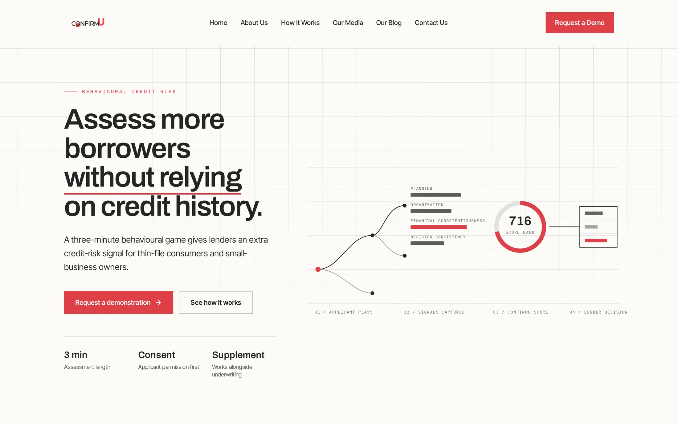
01 · Trigger. Whole first screen visible on the warm paper field.
The first screen is shown whole, then a focus rectangle travels to the region being described and the image crop shifts toward it using object position and a small scale. The frame height is fixed for the whole sequence, so there is no layout shift.
- 01TriggerWhole first screen visible on the warm paper field.
- 02ConstructionFocus rectangle appears over the explanation.
- 03MovementCrop shifts and scales toward the interface detail.
- 04Resolved stateDetail held at readable size, explanation still in view.
- 05PurposeThe product has to be understandable in the opening screen. The crop shift performs that reading: statement first, then the exact interface detail that proves it, in the order a new reader needs it.
How the page was built
01 · Structure
First screen reduced to explanation and action.
02 · Type and colour
Warm paper field, single ink, measured sizes.
03 · Live page
Interface detail added under the explanation.