
02 / 06
WebAcademix
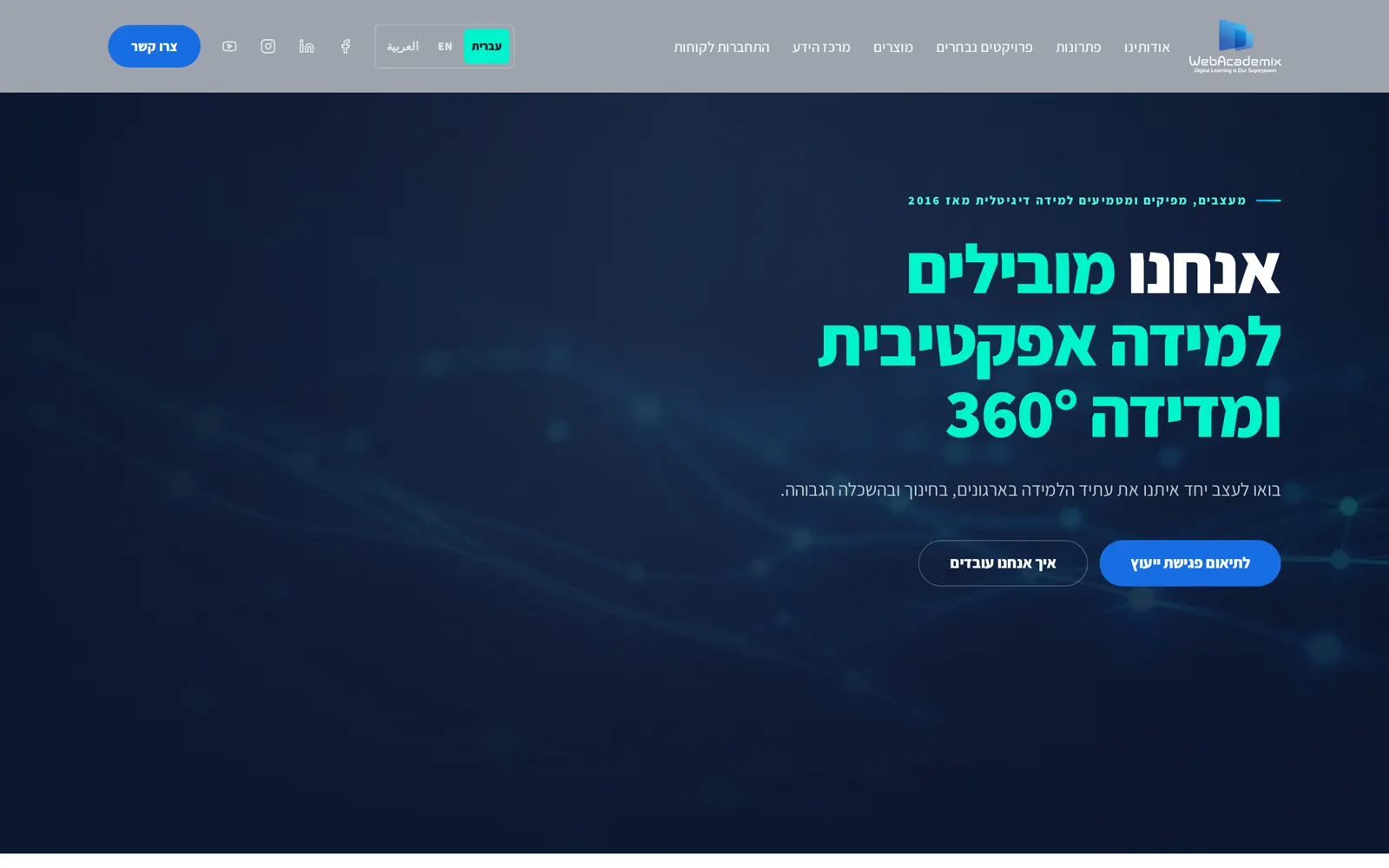
Redesign positioning the company as a premium B2B digital learning studio and technology partner.
SmartDesign case study
About the project
WebAcademix works with business audiences that need to see a studio and technology partner, not a course catalogue.
The previous presentation did not read as premium or as a partner a business would hand a programme to.
A page that establishes seniority immediately and holds that register across a right to left layout system.
Scope
- Website redesign
- Positioning presentation
- Right to left layout system
- Page narrative and hierarchy
- Responsive design
Design premise
Premium reads as restraint. Deep navy, generous space, and a slow progression down the page carry the studio positioning without decoration.
Inside the finished page
Visual system
- Deep navy#0d1931
- Page field#ffffff
- Cool grey#9ea4ad
- Section ink#101b35
- Typography
- Large confident headline sizes over a quiet body size, mirrored for right to left reading so emphasis lands in the same place.
- Grid
- Wide margins with a single narrative column, reversed for right to left so the eye starts where the language starts.
- Imagery
- Restrained supporting imagery, used to punctuate the narrative rather than fill it.
The full page, top to bottom
Motion concept
Masked reveal with staggered headline lines
01 · Trigger. Navy field covers the composition completely.
A solid navy mask slides off the composition, then headline lines rise one at a time behind it with a short stagger, mirrored for right to left so the first line clears where the language starts. The mask is a transform, never a width change, so nothing reflows.
- 01TriggerNavy field covers the composition completely.
- 02ConstructionMask begins to travel, edge aligned to the reading direction.
- 03MovementHeadline lines rise in sequence with a short stagger.
- 04Resolved statePage settled, generous space left intact around the statement.
- 05PurposePremium reads as restraint here. A slow single reveal and a measured stagger hold the same quiet register as the deep navy field and the wide margins.
How the page was built
01 · Structure
Right to left reading order mapped first.
02 · Type and colour
Navy field set, headline scale tuned for seniority.
03 · Live page
Programme sections placed along the narrative.